TicketSwap Redesigned Checkout
When I joined the buying team at TicketSwap, the most popular ticket resale platform in the Netherlands, the mobile app checkout flow was overdue for a redesign and technical refactor. iOS and Android had been built at different times, and worked in small but painfully different ways. This made any small updates a complex puzzle for the team.
At first glance, the checkout looked fine. Conversion was strong and most buyers completed their purchases. But a closer look showed serious UX gaps for anyone who hit an edge case. Too many steps, related information scattered across screens, unclear payment errors, and no visible timer showing how long tickets were reserved. These problems left a noticeable group of buyers unable to complete payment, and often unable to secure tickets for high-demand events. On TicketSwap, demand for second-hand tickets often exceeds the capacity of the entire venue. When a ticket lands in your cart, you need to be able to buy it.
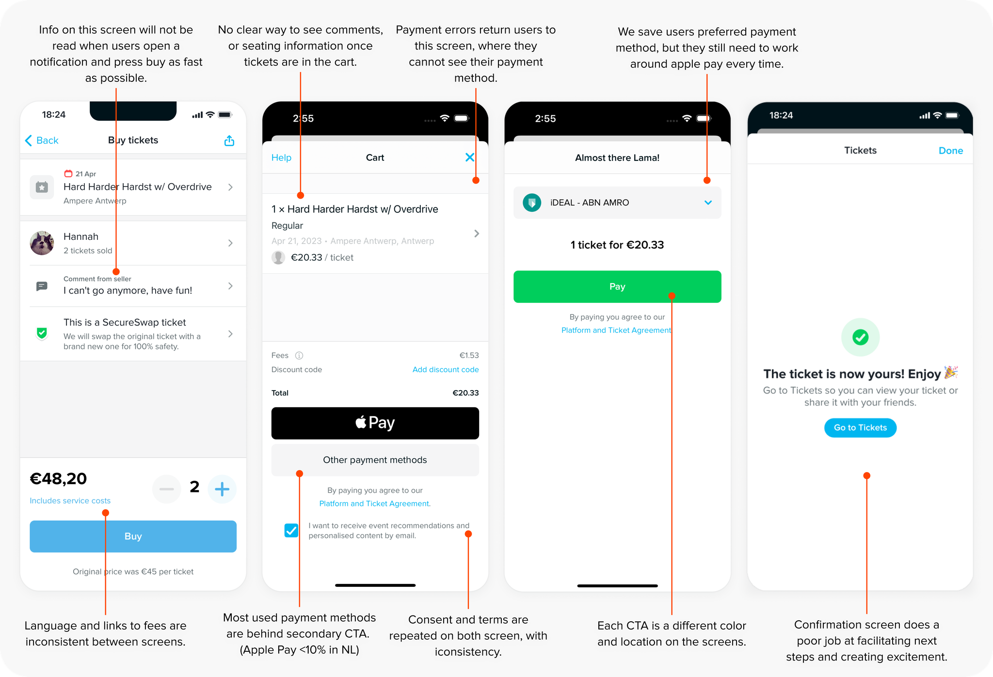 Flow before the redesign
Next to these well needed improvements, we were planning to introduce optional products like insurance during checkout. And there were big concerns about how we would do this without hurting conversion or trust.
The goal: Make checkout feel light and effortless, resilient to errors, and ready to support new products without friction or risk.
Make the flow feel lighter and faster
The first priority was to streamline the main flow. This was done by:
- •
Restructuring and simplifying the screens to reduce cognitive load.
- •
Bringing the UI in line with our refreshed design language, and introducing a new confirmation screen to make the flow feel warmer and more exciting.
- •
Optimising payment paths for new and returning users based on market and user preferences — rather than defaulting to Apple Pay on iOS.
- •
Adding clearer error handling to inform and redirect users to the appropriate screen or next action to best guide them on how to try again.
- •
Introducing a timer to help buyers complete purchases confidently.
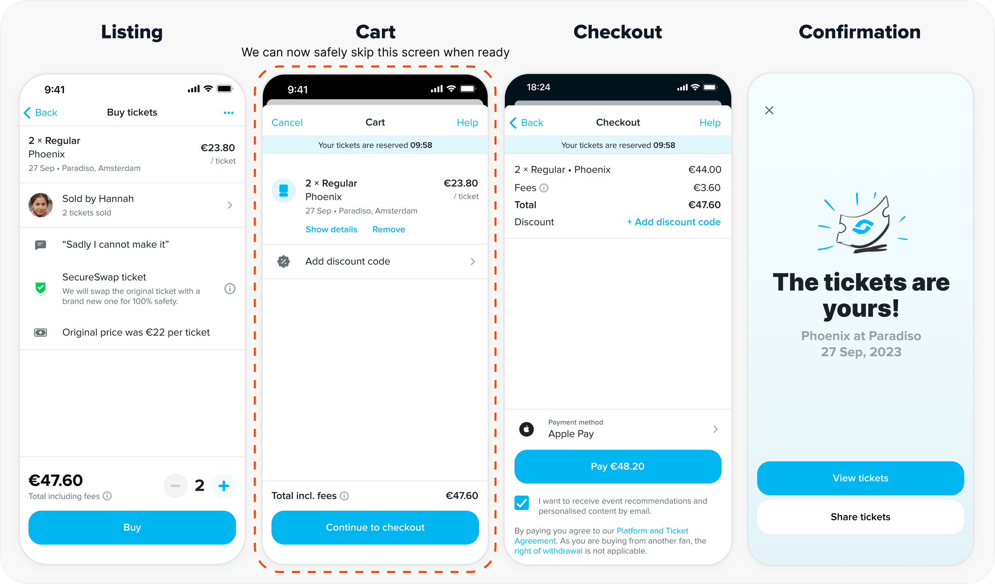 Redesigned flow
I also redefined the roles of the two main screens that make the checkout flow: the cart and checkout. The cart became a simple summary, mostly repeating information that is on the listing screen for buyers that skipped it when racing to reserve tickets. After that, the checkout screen handled all inputs and confirmations. With this clear structure, the goal was to reduce cognitive load for buyers between each step, but it was also a strategic decision to make the checkout screen capable of handling all the critical requirements. This made it possible to later move to a single-screen checkout.
Introduce upsell without costing trust or speed
I designed a modular upsell system to integrate optional products like insurance directly into the checkout screen while keeping the screen simple and compact. Buyers were still able to scan the screen and get to the pay button without having to scroll.
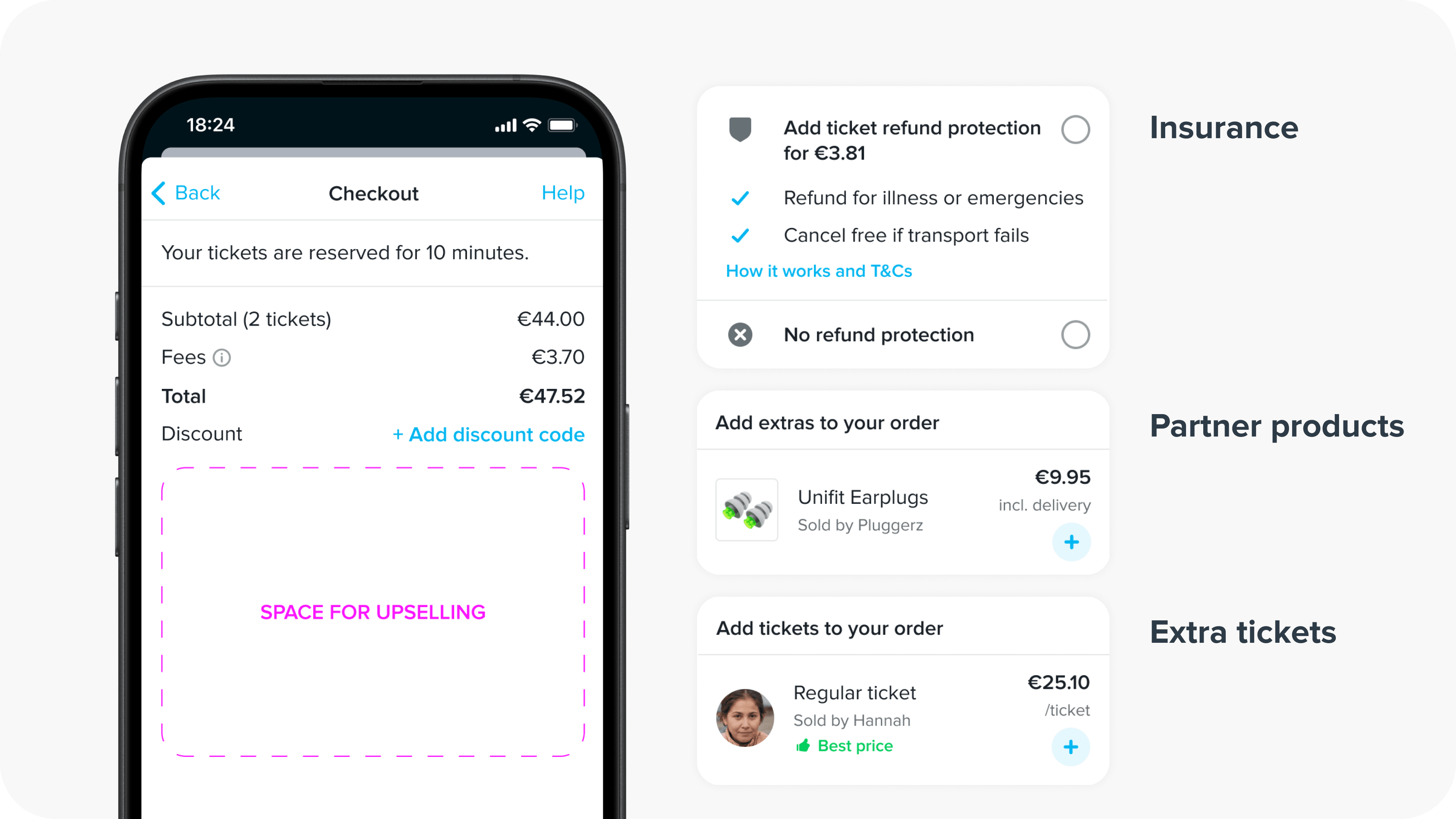
The interaction for insurance selection was built around a simple yes/no choice, which was also made optional to reduce frustration and focus on explaining value instead of pushing revenue.
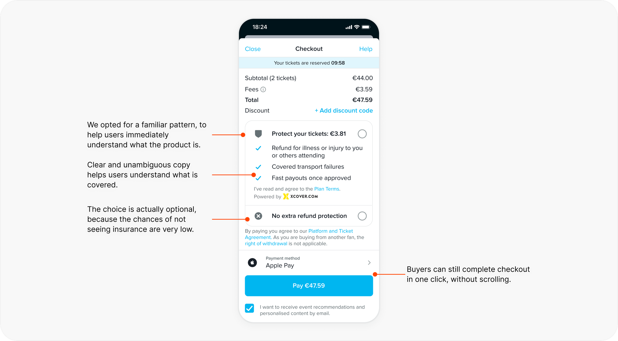
User testing confirmed that the approach was the right one. The familiar pattern and central position on the screen made it unmissable, requiring no additional friction. This mechanism combined with the clear, informative copy made the upsell feel like a choice rather than a trap. To our surprise, test users left the sessions sharing a positive sentiment towards insurance.
Reinforce clarity on safety
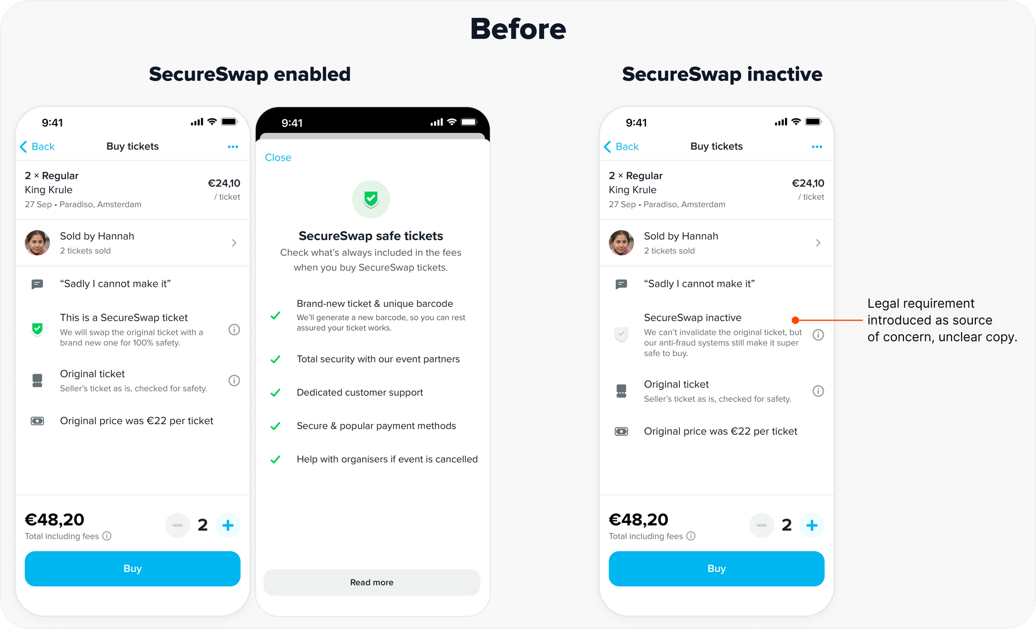
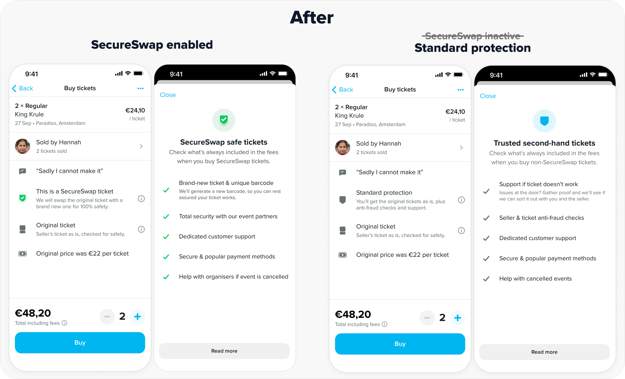
Talking to users, I realised that many showed uncertainty around TicketSwap’s existing safety guarantees. Many believed the new insurance covered protections that were already built into the platform. There was a risk that the new insurance would be misunderstood, or even that users would start to think that they were only protected if they paid extra.
To address the issue, I introduced a clearer way of communicating our safety mechanism as part of the ticket details. With this new system, ticket safety was always presented as a selling point, reminding buyers that even when our more advanced exchange mechanisms were not enabled, they were still protected.
These changes helped make the platform feel safer and set a context where insurance was positioned as a true add-on and not a source of confusion.
Outcomes
- •
Conversion remained stable after launch despite a major structural change.
- •
Impact on support was positive thanks to clearer communication and error handling.
- •
Insurance became a successful new revenue stream with very few rejected claims or support requests, confirming that it was well understood by buyers.
Some things take time
Not every part of the redesign was shipped immediately. One planned step was to remove the cart screen and route buyers directly to a single checkout screen. At the time it was considered too large of a change to take on in one release.
Certain things take longer to happen than others. It's only two years later that the team decided to pursue this approach. But when they did, the only thing they had to do was skip a screen.